Overview of Print Colour
Print colour refers to the specific hues, shades, and tones that are reproduced on a printed medium. It plays a crucial role in various printing applications, from marketing materials and packaging to fine art reproductions and corporate branding. The precision and consistency of print colour directly affect the perceived quality and effectiveness of printed materials. Accurate colour reproduction ensures that the final product matches the intended design, conveying the desired message and emotional impact.
In the realm of professional printing, capturing the exact tone of a colour is essential. Variations in colour can lead to misunderstandings or diminished brand recognition, especially when colours are a core component of visual identity. For instance, a company’s logo must appear consistently across multiple print runs to maintain brand integrity. Therefore, understanding how print colour is managed and controlled is vital for achieving high-quality results.
The importance of print colour extends beyond aesthetics; it also influences customer trust and engagement. Well-reproduced colours can enhance visual appeal, strengthen brand messaging, and evoke specific responses from target audiences. Conversely, discrepancies in colour can undermine the professionalism of printed materials and potentially affect revenue.
To meet these demands, printing services utilize various tools and methodologies to ensure colour accuracy and consistency. The process involves careful selection of colour models, calibration of printing equipment, and precise colour matching techniques. Advances in digital technology have made it possible to reproduce colours more accurately than ever before, meeting the high standards expected in modern printing.
Understanding fundamental concepts of print colour and its significance helps clients and printers collaborate effectively. It ensures that printed outputs meet specifications and expectations, ultimately leading to greater satisfaction and stronger visual communication.

Printing Techniques Affecting Colour
Different printing techniques play a crucial role in how colours are rendered and perceived in printed materials. Each method comes with its own set of advantages and limitations regarding colour fidelity, vibrancy, and consistency. Understanding these techniques helps in selecting the most appropriate process for specific print projects.
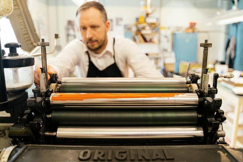
- Offset Printing: This traditional method employs metal plates to transfer ink onto paper. Offset printing is renowned for its high quality and consistency, especially for large-volume jobs. It offers excellent colour accuracy and sharp detail, making it ideal for branding materials, magazines, and catalogs. The process allows for precise colour matching through calibration of plates and press settings.
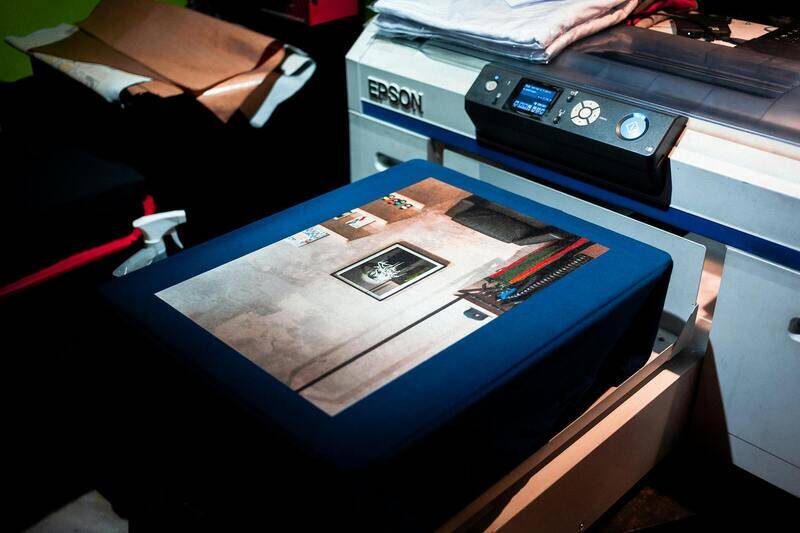
- Digital Printing: Digital printing directly reproduces digital files onto media, typically using inkjet or laser technology. It is highly flexible for short runs and quick turnaround times. Modern digital printers are capable of producing vibrant colours with a high degree of precision, especially when managed with proper calibration and colour management systems. This technique is suitable for personalized printing and small batch production.
- Flexography: Commonly used for packaging and labels, flexography uses flexible plates and fast-drying inks. It delivers vibrant colours and is suitable for continuous patterns or large-scale production. Colour consistency depends on the quality of plates and inks used, as well as precise process control.
- Screen Printing: Used mainly for textiles and promotional items, screen printing applies ink through stencils on a mesh. While it offers bold and opaque colours, achieving colour accuracy requires careful registration and multiple layers for colour blending.

Colour Matching and Calibration
Colour matching is the process of ensuring that colours displayed on digital screens, maintained in design files, translate accurately to the final printed product. Calibration of printers, monitors, and colour management systems plays a pivotal role in this process. Accurate calibration involves setting the device's colour output to match a standard reference, reducing discrepancies across different media and devices.
Professional printers utilize spectrophotometers and colour management software to measure and adjust colour outputs. These tools help in creating custom colour profiles tailored to specific printers and inks, which are then embedded in the printing workflow. This systematic approach ensures that colours remain consistent across multiple print runs, even when there are changes in paper type or ink batches.
Moreover, proofing is an essential step in colour calibration. Digital or printed proofs provide a tangible preview of the final output, allowing for adjustments before mass production. Advanced proofing techniques, such as soft proofing on calibrated monitors and high-quality digital proofs, assist in matching colours accurately and avoiding costly reprints.

Adopting official colour standards, such as Pantone Matching System (PMS), further enhances consistency, especially when specific brand colours need to be matched accurately. Precise calibration and matching not only uphold visual integrity but also assist in maintaining colour fidelity across various print platforms, guaranteeing the final product aligns with initial design intentions.
Overview of Print Colour
Print colour plays a crucial role in conveying brand identity, enhancing visual impact, and ensuring the fidelity of the original design across various media. When selecting a printing service, understanding how colours are produced, managed, and calibrated is essential for achieving consistent and accurate results. The process involves complex interactions between digital design files, printing technologies, and material substrates. Accurate colour reproduction ensures that the final printed product matches the designer’s vision and meets the client’s expectations, which is fundamental in industries such as advertising, packaging, and fine art.

Colour Models Used in Printing
In the realm of printing, colour models serve as the foundational systems that define how colours are created and reproduced. The most prevalent models include CMYK, RGB, and Pantone, each with distinct applications and advantages.
- CMYK (Cyan, Magenta, Yellow, Key/Black): This is the standard colour model used in most commercial printing processes. It operates on subtractive colour principles, mixing inks to produce a broad range of colours. CMYK is particularly effective for full-colour images and photographs, providing a good balance between colour accuracy and cost efficiency. Precise calibration of CMYK colour profiles is critical to achieving consistent results across different printers and media.
- RGB (Red, Green, Blue): Primarily used for digital displays, RGB is an additive colour model that combines light to produce colours. While RGB is not directly used in traditional printing, digital designs are often created in RGB mode before being converted to CMYK for printing. Proper conversion ensures colours remain vibrant and true to the original design.
- Pantone Matching System (PMS): A proprietary colour matching system that assigns specific codes to precisely reproduce exact shades, especially essential for brand colours and corporate identity. Pantone colours are standardized, allowing designers and printers to communicate with complete clarity, ensuring consistency regardless of printing location or media.
Achieving optimal print colour fidelity involves both selecting the appropriate colour model and implementing robust colour management practices. This ensures that the colours seen on screens are accurately rendered on physical substrates, maintaining the visual integrity of the design across various platforms and materials.

Overview of Print Colour
Print colour plays a vital role in translating visual designs into tangible media, affecting how audiences perceive brands, artworks, or informational content. The accurate reproduction of colours hinges on understanding the principles of colour theory, specific printing techniques, and the interplay of various colour models used in the industry. Achieving vibrant, consistent, and precise colours requires meticulous calibration of printers and a deep knowledge of colour management systems. The choice of print colour process is guided by the nature of the project, the type of media, and the desired outcome.
Colour Models Used in Printing
In traditional and digital printing, several colour models serve as the foundation for colour reproduction, each with its unique applications and advantages:
- CMYK Model: The cornerstone of most colour printing, CMYK uses Cyan, Magenta, Yellow, and Key (Black) inks to create a broad spectrum of colours through subtractive mixing. This model is optimized for process colour printing, enabling high-quality image reproduction on various media. Precise control of the ink percentages and proper calibration are essential for consistent results across different printers and substrates.
- RGB Model: Used mainly for digital screens, RGB (Red, Green, Blue) employs light to produce colours additively. When designing for print, digital files are often created in RGB before being converted to CMYK. Careful management of this transition is necessary to preserve colour fidelity, preventing vibrancy loss or shifts that could distort the original design.
- Pantone Matching System (PMS): A proprietary system that assigns specific codes to predefined colours, particularly useful for brand continuity and corporate identity. Pantone colours are consistent across print runs because they rely on standardized ink formulas, making them ideal for spot colours, logos, and critical branding elements.

Printing Techniques Affecting Colour
The method employed in the printing process significantly influences the final colour output. Techniques such as offset printing, digital printing, and screen printing each impart unique characteristics to the colours produced:
- Offset Printing: Known for high volume and high-quality output, offset printing allows for precise colour control through CMYK colour profiling. Its ability to handle large print runs with consistent colour accuracy makes it suitable for commercial projects like brochures and magazines.
- Digital Printing: Ideal for short runs and variable data printing, digital processes offer quick turnaround times. However, maintaining colour consistency can be challenging and requires diligent calibration and colour management software to match the on-screen appearance.
- Screen Printing: Often used for textiles, signage, and promotional items, screen printing involves applying ink through a mesh. The choice and opacity of inks directly impact the vibrancy and opacity of colours, with specialised inks available to achieve specific colour effects.
Each technique's limitations and strengths must be considered during the design and production phases to ensure the printed colours align with the initial creative intent.
Understanding the Impact of Printing Techniques on Colour Accuracy
The printing process's technical aspects play a crucial role in determining the fidelity of colours in the final product. Different methods of printing facilitate varying degrees of colour precision and vibrancy, influenced by the unique characteristics and limitations of each technique. Recognizing these differences allows designers and businesses to make informed choices to meet their colour expectations.
Offset Printing and Colour Precision
Offset printing remains a popular choice for large-volume projects requiring consistent, high-quality colour reproduction. Utilizing CMYK (Cyan, Magenta, Yellow, Key/Black) colour profiles, offset presses enable precise control over colours, resulting in sharp, vibrant images that match design specifications closely. The process involves transferring ink from metal plates onto rubber blankets before printing onto paper, which minimizes colour variation across extensive runs. The use of colour management systems and Pantone spot colours further enhances accuracy, especially when brand colours need to be matched flawlessly.
Digital Printing and Colour Calibration
Digital printing offers versatility and speed, making it ideal for short runs and personalized projects. However, achieving consistent colour output with digital presses requires meticulous calibration and colour management software. Variations in ink formulation, printer settings, and paper types can influence the final colour appearance, necessitating frequent adjustments to ensure colour fidelity. Advances in digital printing technology continue to improve reproducibility, with newer models capable of producing colours that closely align with digital designs and on-screen previews.
Screen Printing and Colour Effects
Screen printing's unique application process involves pressing ink through a mesh stencil onto the substrate, which often results in vibrant, opaque colours. The selection of inks and their opacity levels significantly influence the vibrancy and durability of the printed colours. Specialised inks such as UV-curable or metallic inks expand creative possibilities but also demand careful management to achieve the desired colour effects. The manual nature of screen printing allows for unique textural qualities and vibrant hues, especially on textiles and promotional items.
Technical Innovations and Their Role in Colour Accuracy
Emerging technologies such as inline spectrophotometers and advanced colour management systems are increasingly integrated into printing workflows. These tools continuously monitor and adjust colour output during production, ensuring the colours align with design specifications. Furthermore, innovations like extended-gamut inks and digital spot colour matching expand the possibilities for colour reproduction, enabling exact matches of Pantone colours or achieving desired hues that were previously challenging to reproduce consistently.
These developments illustrate a broader shift toward greater control and reliability in print colour accuracy. They empower printers and designers to meet precise colour standards with confidence, fostering stronger brand consistency and client satisfaction.
Overview of Print Colour
Print colour plays a vital role in delivering visually compelling and accurate representations of designs, logos, and images across various printing projects. Achieving the desired hue, saturation, and brightness requires a comprehensive understanding of the colour systems, printing methods, and calibration processes involved. Whether for branding, advertising, packaging, or personal projects, the precision and consistency of print colour directly influence the final product's effectiveness and aesthetic appeal.
Colour Models Used in Printing
The foundation of producing consistent print colours lies in the selection and application of colour models. CMYK (Cyan, Magenta, Yellow, Key/Black) is the primary colour model utilized in most printing processes. It is a subtractive system that combines these four inks to produce a vast spectrum of colours. The CMYK model allows printers to reproduce intricate colour gradations and detailed images effectively. The process involves layering ink dots in precise patterns to simulate a broad range of colours, ensuring project-specific colour fidelity.
Another important system is Pantone Matching System (PMS), which provides a standardized palette of spot colours. PMS colours are used when exact hues are critical, such as in corporate branding and product packaging. The ability to reproduce Pantone colours reliably during printing is essential for brand consistency, especially when colours need to match across various materials and print runs.
Printing Techniques Affecting Colour
Different printing methods impact how colours are rendered and perceived. Offset printing, widely used for high-volume jobs, offers high colour accuracy and detail, thanks to consistent ink application and advanced registration systems. Digital printing provides versatility and rapid turnaround times, with comparable colour fidelity for shorter runs. Screen printing, on the other hand, introduces unique textural effects and vibrant hues, particularly on textiles and promotional items.
Each method involves specific parameters that influence colour outcomes. For instance, the ink type, substrate material, and curing process can alter how colours appear post-printing. UV-curable inks, metallic options, and other specialty inks expand creative options but require precise control during application to ensure colour integrity.
Colour Matching and Calibration
For accurate colour reproduction, meticulous calibration of equipment is necessary. Modern printing facilities utilize spectrophotometers and colour management software to measure and adjust colours precisely during production. Inline sensors continuously monitor ink colours, making real-time adjustments to maintain consistency. Regular calibration of monitors, printers, and inks ensures that the colours on the screen match the printed output, minimizing discrepancies.
Implementing standardised colour management workflows, including ICC profiles and colour charts, helps align digital design files with actual print results. This process reduces waste and reprints, saving time and resources while guaranteeing that the final product meets the defined colour specifications.
Applications of Print Colour in Different Industries
Print colour plays a crucial role in various sectors, each demanding specific attributes for their projects:
- Branding and Packaging: Consistent colour reproduction affirms brand identity and attracts consumer attention. Precise colours are vital in packaging to ensure product recognition on the shelf.
- Advertising and Marketing: Vibrant colours capture interest and convey messages effectively. Brochures, posters, and banners require accurate colour matching to uphold campaign integrity.
- Textile and Apparel: Bright, durable colours are fundamental for visual appeal and longevity. Custom dyeing and printing techniques depend heavily on precise colour control to meet design specifications.
- Fine Art and Photography: Artistic works necessitate highly accurate colour reproduction to preserve the creator’s original intent and detail.
Understanding the Impact of Print Colour in Industry Applications
Achieving precise print colour is vital across a wide spectrum of industries, each requiring specific specifications to meet their unique standards. From branding to fine arts, the ability to reproduce colours accurately influences consumer perception, product integrity, and artistic expression. When selecting a printing process or service, understanding how print colour interacts with various factors ensures optimal results that align with project goals.
Branding and Packaging
In branding and packaging, colour consistency is paramount. It communicates brand identity, evokes emotional responses, and enhances shelf appeal. Manufacturers depend heavily on controlled print colours to maintain uniformity across different production batches, ensuring that each package displays the same hue regardless of where or when it is produced. This consistency fosters brand recognition and consumer trust, making accurate print colour reproduction a critical factor.
Advertising and Marketing
Marketing materials such as brochures, posters, and banners depend on vibrant, eye-catching colours. The effectiveness of an advertising campaign often hinges on the precision of these colours, which can influence viewer engagement and message clarity. High-quality printing ensures that colours are replicated faithfully from digital designs, preserving the integrity of branding aesthetics and campaign imagery.
Textile and Apparel
The textile industry relies on print colour for both visual appeal and durability. Custom dyeing and printing techniques must produce colours that match the original design intent while also enduring multiple washes and wear. Precise colour matching guarantees that the final apparel or fabric product maintains its vibrancy and intended look over time, which is essential for customer satisfaction and product value.
Fine Art and Photography
Artists and photographers require exceptional accuracy in colour reproduction to convey subtle nuances, mood, and detail inherent in their work. Giclée prints, photographs, and art reproductions demand meticulous colour management processes to preserve the creator's original vision. In these fields, even slight discrepancies can diminish the authenticity and impact of a piece, making precise print colour essential.

In all these applications, the importance of controlling print colour underscores the need for advanced colour management practices and technology. Proper calibration, standardised workflows, and high-quality inks contribute significantly to achieving the desired hue, saturation, and tone, regardless of the printing process or material used. Failure to adhere to these standards can result in colour mismatches that compromise the visual impact and effectiveness of printed materials.
Key Strategies for Achieving Accurate Print Colour
- Utilisation of standardized colour profiles such as ICC profiles tailored to specific printers and substrates.
- Consistent calibration of monitors, printers, and inks to align digital files with printed outcomes.
- Incorporation of colour charts and calibration tools during the pre-press process to verify colour accuracy.
- Regular monitoring and adjustment of ink formulations to maintain specified colour parameters over time.
- Training staff in colour management best practices to prevent common errors and ensure uniformity across projects.
By implementing these measures, industries can mitigate common challenges associated with print colour accuracy, resulting in more reliable, vibrant, and consistent printed products that meet or exceed expectations.
Comprehensive Methods for Confirming Print Colour Authenticity
When aiming for precise colour reproduction in print, relying solely on visual judgment is insufficient. The most reliable approach involves utilizing industry-standard tools and procedures designed for objective measurement and verification. These methods ensure that the colour seen on the screen matches the final printed piece as closely as possible, maintaining fidelity and consistency across different print runs and media.
Utilizing Spectrophotometers for Accurate Colour Measurement
Spectrophotometers are advanced instruments used to measure the spectral properties of colours accurately. By capturing the light reflected or emitted from a printed sample, they provide quantifiable data on its colour attributes, including hue, saturation, and brightness. These measurements are crucial for diagnosing discrepancies, calibrating printers, and ensuring colour consistency. When multiple prints are produced over an extended period, regular spectrophotometric testing helps detect subtle shifts in colour reproduction, enabling timely adjustments and maintaining high standards.

Practitioners often compare the spectral data from printed samples against target colour profiles or standard references. This process helps identify deviations and guides calibration efforts, ensuring the final prints meet predefined colour specifications. Proper handling and interpretation of spectrophotometric data are fundamental skills for professionals committed to achieving optimal print colour fidelity.
Implementing Colour Profiling and Standardization
A critical aspect of verifying print colour accuracy lies in the use of colour profiles, particularly International Color Consortium (ICC) profiles. These profiles encode the colour capabilities of specific devices, inks, and substrates, serving as a bridge between digital colour data and physical output. By embedding the appropriate ICC profile into the workflow, printers and designers can reduce colour mismatches and ensure consistent reproduction across different materials and machines.
Consistent calibration of monitors, printers, and scanners is equally vital. Calibration involves adjusting device settings to match a known standard, aligning digital and printed colours. Combining this with the regular application of colour charts — such as GretagMacbeth color reference sheets — provides a practical means for ongoing validation. With each print job, comparing the output against these standards confirms whether the colour reproduction remains within acceptable thresholds.
Standard Operating Procedures for Colour Verification
- Pre-press calibration: Regularly calibrate imaging and printing devices using certified tools and methods.
- Colour target testing: Use colour reference charts to verify output accuracy during critical print runs.
- Sample matching: Print test sheets and compare against digital proofs with spectrophotometric measurement for objective validation.
- Documentation: Record calibration data and measurement results to track consistency over time.
- Adjustments and recalibration: Based on measurement feedback, fine-tune printing parameters to correct any colour deviations.
Additional Technologies Supporting Accurate Printing
Emerging technologies, such as inline spectrophotometry integrated within printing equipment, enable real-time colour monitoring. These systems automatically detect and correct deviations during printing, drastically reducing rework and waste while ensuring uniform colour quality throughout production. Advanced colour management software also facilitates complex workflows, allowing seamless integration of device calibration, profiling, and verification processes to streamline conformity to colour specifications.

By adopting these robust measurement and verification practices, printing professionals can confidently uphold the integrity of colour fidelity, satisfying the standards of clients who demand precision, whether in branding, marketing, or fine art reproduction.