Understanding Business Card Design
Creating an effective business card requires a strategic approach that balances aesthetics, functionality, and brand representation. The key elements of a successful business card design include a well-organized layout, strong branding components, and a clear visual hierarchy. The layout ensures that the information is easy to read and logically arranged, while the branding elements — such as logos, color schemes, and typography — reinforce brand identity and leave a lasting impression on recipients. Visual hierarchy guides the viewer’s eye to the most critical pieces of information first, such as the individual’s name and contact details, ensuring they are immediately accessible. Thoughtful placement of these elements, combined with a cohesive color palette and stylish typography, enhances the overall professionalism of the card. Moreover, a good design considers the target audience and the nature of the industry, customizing the style to suit the specific context. Overall, the design of a business card serves as a reflection of a brand’s personality and professionalism, making it essential to adhere to best practices that emphasize clarity, consistency, and visual appeal.

Choosing the Right Card Dimensions and Shape
Selecting appropriate dimensions and shapes for business cards is a fundamental step in creating a memorable and functional design. While the standard size for business cards is typically 3.5 x 2 inches, variations can help a card stand out or better suit specific industry needs. Custom sizes, such as square, rounded corners, or elongated formats, can convey a modern or sophisticated brand image, provided they maintain practicality for cards to fit comfortably into wallets or cardholders.
Unique shapes—such as circular, die-cut, or asymmetrical designs—offer visual interest and can emphasize creativity or innovation within certain sectors. However, these distinctive forms must be balanced with usability considerations; overly intricate shapes may compromise ease of handling or pocket compatibility. When exploring custom shapes, collaborating with professional printers ensures precise fabrication and reinforces the card’s overall quality.

The influence of dimensions and shapes extends beyond aesthetics. They also impact the perception of the brand, signaling traits such as professionalism, uniqueness, or tradition. For instance, a sleek, elongated card can suggest a modern, cutting-edge enterprise, while a rounded corner design may evoke friendliness and approachability. Selecting the right size and shape should align with the brand’s identity and serve the card’s functional role in networking and communication.
Material and Finishing Options
The choice of materials and finishes plays a pivotal role in communicating the quality and personality of a brand. Traditional options such as thick cardstock or matte finishes provide a solid, understated look suitable for corporate environments. Conversely, textured surfaces, glossy coatings, or specialty materials like metal or transparent plastic introduce a tactile and visual dimension that can set a business card apart.
Finishing techniques, including embossing, debossing, spot UV coating, or foil stamping, add sophistication and depth to the design. These enhancements not only elevate the aesthetic appeal but also reinforce brand messaging through subtle tactile cues. For example, foil accents can highlight a logo or key information, drawing immediate attention and projecting a sense of luxury or prestige.

When selecting finishes, it is essential to consider durability and the card’s intended lifespan. Premium finishes may incur higher costs but often justify the investment through enhanced visual impact and tactile experience. As visual and physical components intertwine, they collaboratively create a compelling representation of the brand, making the business card not merely a contact tool, but a strategic marketing asset.
Understanding Business Card Design
Developing an effective business card design requires a combination of strategic content placement, visual coherence, and alignment with branding goals. It begins with a clear understanding of the core message and the target audience, ensuring that the design communicates professionalism and credibility. The layout should be clean and organized, allowing vital information such as the individual’s name, job title, company name, contact details, and logo to be easily accessible. Consistency in design elements, including color scheme, typography, and imagery, reinforces brand identity and makes the card memorable.
Effective business card design also considers the visual hierarchy—highlighting the most important elements through size, contrast, and placement. Icons and graphics can be utilized to break the monotony and guide the viewer’s eye, but these should complement the overall aesthetic without cluttering the layout. White space remains a crucial component, providing breathing room for text and preventing the design from appearing overloaded. Additionally, the use of high-resolution images and vectors ensures sharpness and clarity across different printing formats.

Design Symmetry and Consistency
Maintaining symmetry and consistency across design elements fosters a cohesive appearance. This involves aligning text, logos, and graphics in a way that creates visual stability and harmony. The choice of fonts should reflect the brand personality—professional and traditional fonts for corporate firms, or modern, playful typefaces for creative industries. The color palette should resonate with existing branding assets and evoke the desired emotional response. These elements work together to produce a unified and professional look that leaves a lasting impression.
It’s also essential to test different design concepts and gather feedback to refine the final output. Mockups and prototypes allow for evaluation of how the card appears in real-world conditions, ensuring that the design remains functional and attractive once printed.
Functional and Aesthetic Considerations
The design process should address both aesthetics and functionality. While elaborate designs can showcase creativity, they should not compromise the readability or practicality of the card. For example, overly intricate backgrounds may hinder the legibility of contact information, and excessive embellishments could detract from the professionalism the card aims to convey. Balancing artistic expression with clarity guarantees that the business card fulfills its primary role as a communication tool while also serving as a reflection of the brand’s identity.
In terms of printing, selecting the right specifications and materials is integral to translating the design onto physical media successfully. High-quality paper stock, suitable finishing options, and precise color matching contribute to a polished final product that supports brand perception and networking efforts.
Incorporating Branding Elements
Effective business card design hinges on the strategic integration of branding components that reinforce brand recognition and personality. Logos serve as the visual anchor of a brand; therefore, their placement and size on the card should be carefully considered to ensure visibility without overwhelming other essential information. Positioning the logo prominently, typically in the top left corner or centered, facilitates instant identification and creates a cohesive look. Color schemes play a critical role in branding continuity. Utilizing the company's primary or secondary colors not only maintains consistency across marketing collateral but also evokes specific emotional responses aligned with brand values. Taglines or brand slogans can be incorporated subtly, either beneath the logo or alongside contact details, in a manner that complements the overall design without distracting from vital information. Furthermore, typography should reflect the brand's personality, whether it's formal, innovative, friendly, or edgy. Selecting complementary fonts for headings, subtexts, and contact details enhances readability and visual harmony. Consistent use of core brand fonts throughout the card design promotes visual coherence and reinforces brand identity. Special patterns, textures, or motifs that relate to the industry or brand story can be subtly embossed or foiled to add a tactile dimension. These elements, when used thoughtfully, help the business card stand out physically and visually, creating a memorable touchpoint with potential clients or partners.
Materials and Finishing Options
The choice of materials fundamentally influences the tactile experience and durability of business cards. High-quality paper stocks such as matte, gloss, or uncoated finishes not only elevate the aesthetic appeal but also impact the overall perception of professionalism. For a luxurious feel, thicker card stocks, such as 16pt or 32pt, are preferred, providing robustness and a premium touch. Finishing techniques further refine the card’s appearance and durability. Matte finishes offer a subdued, sophisticated look and reduce glare, while gloss coatings enhance vibrancy and color saturation, making graphics and images appear sharper. Soft-touch finishes add a velvety texture that exudes elegance, suitable for high-end brands. Specialty coatings like spot UV gloss can be applied selectively to emphasize logos or particular design features, creating a striking contrast against matte backgrounds. Foil stamping, often used in gold, silver, or metallic hues, introduces reflective accents that catch light and draw attention. Edge painting, embossing, and rounded or die-cut shapes open additional avenues for customization. These options enable brands to push creative boundaries and produce business cards that not only communicate contact information but also bolster brand storytelling through sensory experience and unique design elements.

Incorporating Branding Elements
Effective business card design hinges on seamlessly integrating key branding elements to create a memorable and authentic representation of your business. These elements include your company logo, color palette, typography, and any visual motifs that are consistent with your broader branding strategy. The placement and size of these components should be carefully considered to maintain a harmonious and professional appearance.
Consistency is vital; using the same logo and color schemes across all marketing materials reinforces brand recognition and trust. For instance, positioning the logo prominently at the top or corner of the card ensures visibility without overpowering other essential contact details. Incorporating brand-specific icons or patterns subtly into the background can also enhance the visual identity without cluttering the layout.
Typography plays a crucial role as well, serving not just a functional purpose but also contributing to the brand personality. Selecting fonts that align with your brand’s tone—whether modern, traditional, playful, or elegant—ensures coherence across all brand touchpoints.
Incorporating branding elements thoughtfully into your card design helps communicate professionalism and authenticity. The goal is to create a cohesive visual narrative that resonates with your target audience and leaves a lasting impression.
Additionally, consider the use of subtle textured backgrounds or embossed patterns to enhance tactile engagement without compromising readability. These nuanced details can elevate the perception of quality and craftsmanship associated with your business.
By adhering to these principles, your business cards will serve as effective ambassadors for your brand, conveying credibility and encouraging connections that can translate into future opportunities.
Materials and Finishing Options
Choosing the appropriate materials and finishing techniques for your business cards is crucial in creating a tactile and visual impression that aligns with your brand identity. The selection of card stock impacts durability, texture, and overall feel, contributing to how recipients perceive your professionalism and attention to detail. Common options include standard matte or gloss finishes, each offering distinct aesthetic qualities. Matte finishes provide a sophisticated, non-reflective surface that minimizes fingerprints and smudges, ideal for designs emphasizing subtlety and elegance. Gloss finishes, on the other hand, enhance color vibrancy and add a shiny, eye-catching appeal that’s suitable for vibrant graphics and logos.
Specialty finishes such as soft-touch coatings offer a luxurious feel, creating a sense of exclusivity. Embossing and debossing techniques add texture, elevating certain elements like logos or icons to stand out physically and visually. Foil stamping, which applies metallic or colored foil to specific areas, can underline brand elements or highlight key details, adding a layer of sophistication that makes the card memorable. Spot UV coating is another option that provides a glossy, raised effect on selected sections, providing contrast and visual interest without overwhelming the overall design.
- Laminate layers: Enhance durability and resistance to wear and tear, making your cards suitable for long-term use.
- Edge coloring: Adding color to the edges of your business cards can serve as a subtle yet impactful branding detail, especially when paired with matching or contrasting hues.
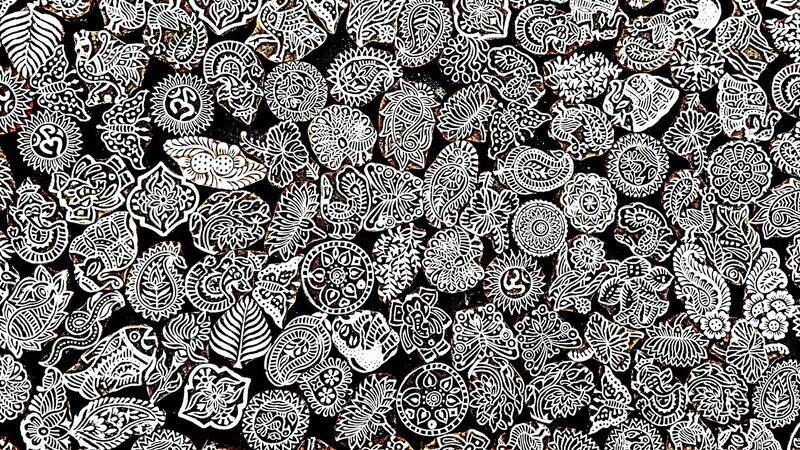
- Custom shapes: Moving beyond traditional rectangular cards, custom die-cut shapes reflect creativity and can make your cards more distinctive. Examples include rounded corners, circular formats, or uniquely cut outlines tailored to your brand identity.
Optimizing material and finishing choices according to the intended impression and functional requirements ensures your business cards not only look professional but also endure in the hands of recipients. Carefully selected options contribute to a cohesive brand story and reinforce the values associated with your business, whether it's innovation, craftsmanship, or luxury.

Understanding Business Card Design
Designing an effective business card involves a combination of visual appeal, clarity, and strategic branding elements. The layout should balance text and imagery to communicate professionalism while maintaining readability. Consider the hierarchy of information, ensuring that your name, title, and contact details are immediately recognizable. Incorporate your logo and brand colors thoughtfully—these elements should complement the overall design without overwhelming it. When designing your business card, aim for a style that reflects your industry and personal brand identity. Minimalist designs work well for corporate environments emphasizing professionalism, while more vibrant or creative layouts may suit industries like marketing or artistic fields. The design process also involves selecting appropriate fonts, spacing, and alignment to create a cohesive look that aligns with your brand's tone and message. An eye-catching, well-structured business card can leave a lasting impression and facilitate valuable connections. This phase also includes considering accessibility, such as font size and color contrast, ensuring that the information remains legible for all recipients.

Choosing the Right Card Dimensions and Shape
Traditional business cards typically measure 3.5 x 2 inches, but exploring different dimensions and shapes can make your cards stand out. Opting for custom sizes allows you to convey creativity or align with your industry standards, such as slightly larger cards for luxury brands or minimalist thin designs for tech startups. Shape options extend beyond the rectangular format; rounded corners soften the overall look, making cards more comfortable to hold and handle. Die-cut shapes, such as circles, ovals, or custom outlines matching your logo or branding motifs, provide a unique tactile experience. When choosing dimensions and shapes, consider the practicality of storage and the compatibility with standard card holders or wallets. It's important that the size remains manageable and does not compromise the clarity or legibility of your contact information. Clients and prospects should find your card easy to carry and store while making a memorable impression through its distinctive design.
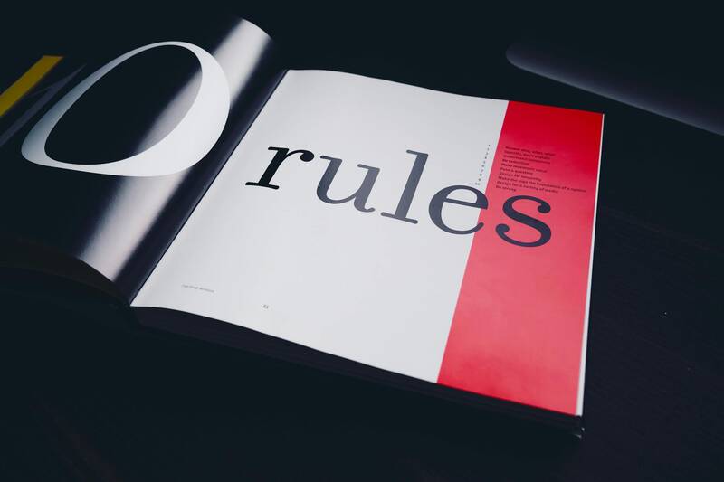
Color Schemes and Typography
Color selection plays a pivotal role in establishing brand recognition and evoking the desired emotional response. Utilizing a color palette consistent with your branding helps reinforce your identity and creates visual cohesion. Complementary or analogous colors can be used to create a sophisticated look, while bold, contrasting colors grab attention and convey confidence. Typography should also be carefully chosen—select fonts that align with your brand personality, whether it’s modern and sleek or traditional and authoritative. Ensure that the font size maintains readability across different lighting conditions and distances. Combining different font styles—such as bold for headings and regular for contact details—adds visual hierarchy. Use ample spacing to prevent clutter and ensure that each element is distinct. Additionally, consider implementing color blocking—using contrasting colors to differentiate information sections—making it easier for recipients to scan the card quickly and accurately.

Incorporating Branding Elements
Your business card should be a reflection of your overall brand identity. Incorporate logos, taglines, and brand imagery in a way that complements the design without cluttering it. Position your logo prominently—usually in a corner or centered—to reinforce brand recognition. Consistency is key; use your established brand colors, fonts, and imagery styles to create a unified look that extends beyond the business card into your other marketing materials. If your brand has specific iconography or graphic motifs, consider integrating these into the design to further personalize the card. Maintaining a clean and organized layout ensures that branding elements enhance rather than overwhelm the core message. In some cases, subtle watermarking of the logo or embossing techniques can add tactile and visual dimension, lending a sense of craftsmanship and attention to detail. Remember, every element on your business card should work in harmony to communicate your brand story effectively.

Materials and Finishing Options
The choice of materials impacts both the tactile experience and durability of your business card. Common options include standard cardstock, which provides a sturdy foundation, and premium materials like thick matte or gloss finishes that elevate the perceived quality. Specialty materials such as textured papers, transparent or translucent plastics, or recycled stocks can showcase eco-consciousness or innovation. Finishing techniques further enhance the visual appeal and tactile feel: matte finishes offer a sophisticated, non-reflective surface that minimizes fingerprints; gloss finishes provide a vibrant, eye-catching shine; and soft-touch coatings create a velvet-like feel that exudes luxury. Additional options such as Spot UV coating can be applied selectively to highlight logos or design elements with a glossy, raised surface, adding depth and contrast. Edging techniques, like colored or beveled edges, add a subtle pop of color and refinement. Embossing and debossing introduce tactile dimension to logos or patterns, making the card more memorable. Laminates and protective coatings ensure the durability of your cards, especially important if they are subjected to frequent handling or environmental stresses.

Creative Design Ideas and Trends
Staying current with design trends can help your business card stay fresh and engaging. Incorporate minimalist aesthetics with clean lines and ample white space to project professionalism. Utilizing asymmetrical layouts or dynamic visual elements can create a sense of movement and innovation. Incorporate textured or embossed details to provide tactile interest, encouraging recipients to engage physically with your card. Trendy finishes such as metallic foils, holographic effects, and neon accents are becoming popular for brands seeking a bold statement. Use innovative die-cut shapes for a distinctive look—such as cards resembling your product or reflecting your industry theme. Flat design with vibrant, contrasting colors remains a popular choice for digital clarity, but physical cards benefit from layered effects, textures, and finishes that add depth. Infographic-style cards, with visual representations of services or data, can be impactful in certain industries. Remember to balance creativity with clarity—your design should stand out without sacrificing the ease of reading essential contact information. An effective business card design leverages current trends but remains true to your unique brand identity, ensuring it resonates with your target audience.
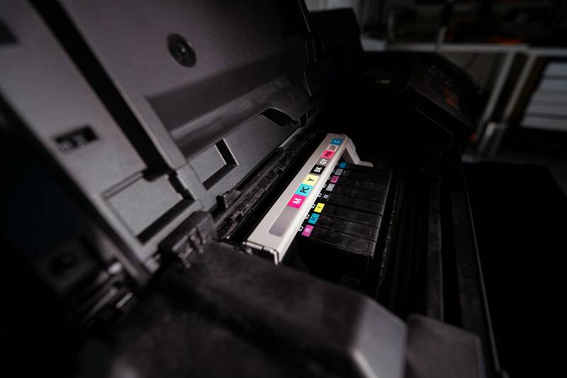
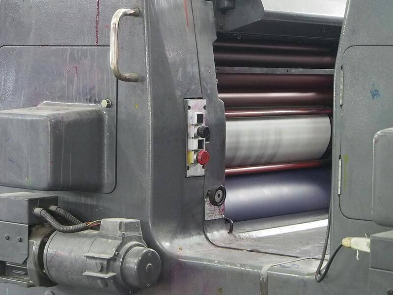
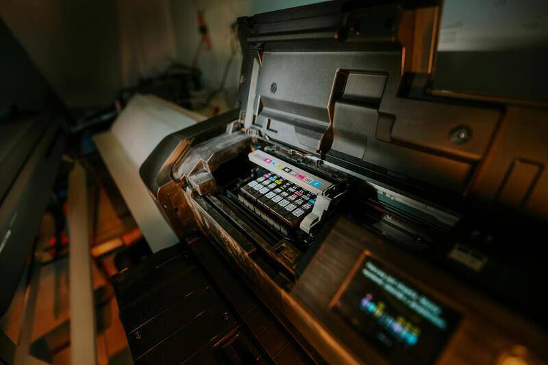
Printing Services and Quality Assurance
Choosing the appropriate printing provider is essential to achieving a professional and durable business card. Reliable printing services utilize advanced technologies such as offset printing and digital printing, which allows for vibrant color reproduction and crisp details. Offset printing is ideal for bulk orders, offering high-quality results with consistent color accuracy, while digital printing provides flexibility for smaller quantities or quick turnaround times.
When selecting a printing partner, consider their portfolio, customer reviews, and their familiarity with various printing techniques and finishing options. Request samples or proofs before placing the full order to verify color fidelity, paper quality, and print resolution. This step helps prevent costly errors and ensures the final product aligns with your brand vision.
Understanding the production process can further guarantee quality. For instance, many printers employ prepress checks, color calibration, and quality control measures to maintain high standards. A reputable printer will also offer consultation on paper stocks, finishes, and special effects such as embossing, foiling, or spot UV coatings.
To ensure high-quality results, clarify the specifications for the print run. These include:
- Paper Type: Select from matte, gloss, soft-touch, or textured finishes based on your desired tactile experience.
- Color Profile: Confirm that the color mode is set to CMYK for accurate color reproduction in print.
- Finish Effects: Decide on additional features such as matte lamination, gloss UV coating, or embossed elements to enhance visual appeal and durability.
Proper communication with your printer is key throughout the process. Make sure to specify your preferred dimensions, design specifications, and any special effects you want incorporated. Working with a professional printer who adheres to strict quality assurance protocols will maximize the chance of a successful outcome, resulting in business cards that make a memorable impact.