The finishes you can feel with your fingers.
Most business card decisions are made on a screen. You choose a color, a font, a layout, and evaluate the results based on their appearance. However, when the cards arrive and someone picks one up, the first thing they notice has nothing to do with any of those design elements. It is the texture.
Embossing, debossing, and letterpress all work on the card's surface rather than adding another layer of ink on top. These techniques change the texture of the card, making them more difficult to reproduce and more memorable. However, these methods are also more expensive per card and can be prone to errors if not handled correctly during the printing process.
This guide explains what each process entails, which artwork survives it, and when the associated cost is justified.

Three processes, often confused
These three terms are often used interchangeably in conversation, even though they represent distinct concepts. This confusion can lead to financial losses, particularly when someone orders one item expecting another.
Embossing
Embossing is a process that raises a design on card stock. This is achieved by pressing a metal die against the sheet, which is then pressed into a corresponding counter-die. The result is a raised design that you can feel and see as a recess on the reverse side. Ink is not used in this process unless it is added separately.
Blind embossing, which involves embossing without any ink, is the version that appears most luxurious. It creates a shape in the paper itself, catching light rather than color. On a white card with a white logo, it can look understated to the point of arrogance, which for some brands is exactly the point.
Debossing
The same concept in reverse. The die presses down, and the shape indents into the card. Debossing is the more forgiving technique, as pressing into the material is easier than pushing it up. Additionally, it works well on softer, thicker materials that would likely tear if you attempted to raise them.
Letterpress
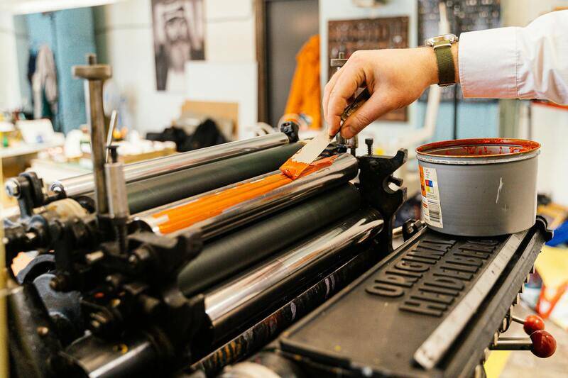
Letterpress combines printing and pressing into one process. Inked plates press into damp, soft paper, leaving behind both color and a visible impression on the surface. It originates from the oldest printing tradition still in commercial use. The modern version intentionally presses harder than the original ever did, because the impression is now a key selling point rather than a flaw.
| Process | Direction | Ink | Best stock |
|---|---|---|---|
| Embossing | Raised | Optional | Firm, not too thick |
| Debossing | Recessed | Optional | Thick, soft, forgiving |
| Letterpress | Recessed | Always | Soft, cottony, thick |
Why the stock decides everything
Here's the part that often confuses people. These processes don't work uniformly on every card, and the stock you've already chosen might not be compatible with the finish you desire.
Letterpress printing requires soft paper. Cotton stocks are the classic choice because the fibers compress and hold the impression without cracking. Using a hard, coated stock would result in the plate having nothing to bite into. This would lead to ink being applied but with almost no depth, which defeats the purpose of letterpress printing.
Embossing needs the opposite balance. The stock has to stretch without splitting. Thin card tears at the edges of a raised shape. Very thick card resists rising at all. There is a middle range where it works well, which is one of several reasons the weight conversation happens before the finish conversation. Our guide to card thickness across 260, 300, 350 and 400 gsm is a useful starting point.
Coated and laminated surfaces add an additional layer of complexity. A soft-touch laminate over an emboss can soften the precise edge definition you paid for. This doesn't mean the combination is wrong; it does mean that you should ask to see it in person rather than assuming it will work as expected.
What artwork has survived, and what has not?
Every one of these processes has a resolution limit, which is much coarser than print. The die, made of metal, presses against paper fibers. As a result, fine details simply round off.
- Hairline strokes disappear, and thin lines require additional weight before they can be embossed at all.
- Small text below roughly 8 points becomes an unreadable smudge when filled in.
- Very fine gaps between elements close up as the paper stretches.
- Large solid areas emboss poorly because there is nothing for the die edge to define.
- Sharp interior corners naturally round themselves off, regardless of your preference.
The practical consequence: a logo designed for screen often needs a separate, simplified version for these processes. That is normal work, not a sign of a bad logo. Send your artwork as vector files and say which elements should be raised, because a printer cannot reliably guess it from a flat file. The basics of preparing files properly are covered in our guide on setting up a print-ready business card file.

What it costs and why
These finishes involve a setup cost that ordinary printing does not, since a die needs to be created. The die is a physical piece of metal customized for your artwork, and you only pay for it once.
This shift in arithmetic is important to grasp. When dealing with 100 cards, the cost of the die dominates the overall price, making the cost per card seem high. However, when the quantity increases to 1000 cards, the same die is distributed across ten times more cards. Consequently, the per-card premium significantly decreases.
Two cost points that surprise people:
- Two-sided work requires careful attention. An emboss on the front creates a recess on the back, so the reverse design must accommodate this.
- Multiple positions can involve using multiple dies, which multiplies the setup time rather than simply adding to it.
Compared with foil, which also uses a die and adds metallic material, embossing is often the cheaper way to signal quality. The two are frequently combined, and combined they are expensive. Our guide to foil-stamped name cards covers that side.
When it is worth it
Not every card provides value. If you distribute 500 cards a month at trade events, the per-card premium buys you very little. A well-chosen stock could do more. The case is strongest when cards are given rarely and deliberately. For example, an architect, a lawyer, a jeweller, or a consultant whose fee makes the card cost irrelevant.
The true test of a card's appeal lies in whether the recipient will hold onto it for more than just a second. The texture of the card only justifies its cost if someone's fingers linger on it. A card that is immediately tucked away into a stack has no chance to leverage the one advantage that this finish offers.
Seeing it before you commit
We produce embossed, debossed, and letterpress cards. We prefer discussing your artwork before you place an order, rather than explaining afterward why fine lines have disappeared. Send us your logo, and we will honestly inform you about what will work at that size, what needs to be thickened, and whether the stock you like will support the finish you desire.
We keep samples of each process on a range of stocks, because this is not a decision anyone should make from a screen. If you are choosing between raised gloss and a genuine emboss, comparing them in your hands takes about four seconds and settles it. Our guide to spot UV explains where that alternative fits.
You can see the full range under business card printing, or send your artwork through our contact page and ask what it will take. If the answer is that your logo needs redrawing for the die, we will say so before you pay for one.