The blank back is a choice, not a leftover
Most name card files reach a print shop with one side finished and the other empty. Sometimes that is deliberate. More often nobody decided, the template arrived that way, and the back stays white by accident. Single-sided printing does cost less, but on a digital press the gap is narrower than people assume - across a box of 500 it is usually a few dollars, because the press is already set up and the reverse is one more pass.
So cost is rarely the deciding factor. The question is whether the second side earns its space, or whether it just gives someone one more thing to squint at. Both answers are legitimate. A card for a designer or an architect often works better with a clean back and a single small mark. A card for a clinic, a workshop or a shop with opening hours usually has something concrete to say there.
What actually earns space on the back
The front of a card carries the name, the role and the way to reach you. Anything repeated on the back is wasted. These are the things that genuinely benefit from the extra surface.
A second language
In Singapore and across the region, a card with English on one side and Chinese on the other is standard practice rather than a flourish. Keep the two sides visually identical in layout so the card does not read as two different companies. Have the translated side checked by someone who uses the language daily - a transliterated company name that looks fine in a font preview can land badly in conversation.
A QR code that leads somewhere useful
A QR code pointing at a home page adds little. One pointing at a booking form, a price list, a portfolio or a saved contact file does real work. Print it at 15mm square or larger, keep a clear white margin around it, and test the printed card rather than the screen version - codes printed small on a dark background over an uncoated stock are the ones that fail to scan. If the destination might change, use a link you control and can redirect later.
One line about what you do
Job titles rarely explain a business. A single sentence on the back - what you make, who you make it for - saves the recipient from guessing three weeks later when the card surfaces in a drawer. Keep it to about ten words and write it the way you would say it out loud.
Practical detail
- Opening hours, for anywhere a customer walks in
- A simple map or a landmark, for units in industrial estates and upper floors
- An appointment or warranty line, where the card doubles as a reminder
- A licence or registration number, where the trade requires one
- A short list of services, if the business does one thing per line and no more
What does not belong there: a second phone number nobody answers, a social handle that has been dormant for a year, or a company slogan written for an investor deck.
What the second side costs to print
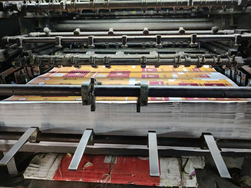
On digital presses, double-sided name cards are priced as a small step up rather than double. The larger cost differences come from what you print there. A back covered edge to edge in solid colour uses noticeably more toner or ink, and on some stocks it needs a heavier laminate to stop the coverage from scuffing in a wallet. A back with black text on white sits at the bottom of the range.
Two other effects are worth knowing before you commit. Heavy ink coverage on one side of an uncoated sheet can pull the card very slightly out of flat, which is more visible on lighter weights - one reason cards with dark backs are often ordered on 350gsm or above. And a dark back shows every white speck along the cut edge, so trimming tolerance that would pass unnoticed on a pale card becomes visible. If you want a saturated colour back, order it on a heavier stock and expect the edge to be part of the look. Our guide to choosing paper weight for business cards covers where those thresholds sit.
Design limits people hit on the reverse
The back is where most reprints start, usually for one of four reasons.
Bleed and safe zone get forgotten. Designers set up the front carefully and then drop a logo onto the back without extending the background past the trim line. Any colour that should run to the edge needs 3mm beyond it, and nothing you care about should sit within 3mm of the cut.
Contrast is judged on a screen. Mid grey text on a mid grey field looks refined at 200 percent zoom on a monitor and disappears at actual size in a lift lobby. Print a page at 100 percent, cut one out, and read it at arm's length.
Registration is assumed to be perfect. Front-to-back alignment on a digital press is close but not absolute, typically within a fraction of a millimetre. A design that lines up a shape on the front with a shape on the back to the hairline will show that variance across a run.
The finish is applied without thinking about the stock. Spot UV, foil and soft-touch laminate all behave differently on coated and uncoated surfaces, and the same file can look sharp on one and muddy on the other. The comparison in coated or uncoated name card stock is the shortest way to work out which surface suits your artwork.
Ordering a double-sided card without surprises
We print single and double-sided name cards on the same schedule, and the reverse does not add a production day. What slows an order down is nearly always the file, so it helps to send the back the way the press wants it.
- Two pages or two files, clearly labelled front and back, in the same size and orientation
- PDF with fonts embedded or outlined, 3mm bleed on both sides, 300dpi for any image
- CMYK for full colour work, or a named Pantone if a brand colour has to match across reprints
- Any QR code supplied as vector, not as a screenshot pulled from a browser
- A note on which side the finish applies to, if you are ordering lamination, foil or spot UV
Send those and you get a proof back showing both sides as they will trim. Check the small things there rather than after delivery: the spelling of a name, the digits of a phone number, and whether the QR code scans from the proof itself. We keep approved files on record, so a reprint six months later runs from the same artwork rather than a newly exported version that has drifted.
If you are still deciding what belongs on the reverse, our business card printing and name card printing pages list the stocks and finishes available for each, with the double-sided options priced alongside. Send the artwork you have, even if the back is still empty, and we will tell you what it will look like trimmed - talk to us before you commit to a run of 500.