Understanding Color Printing
Color printing is a specialized process that involves reproducing images, text, and graphics in a full spectrum of hues to create vibrant, eye-catching outputs. Unlike traditional black-and-white printing, which relies solely on varying shades of monochrome tones, color printing employs multiple inks or toners to produce a wide array of colors that enhance visual appeal and understanding. This capability is crucial for businesses, artists, and marketers who aim to communicate messages more effectively through vivid visuals and precise color matches.
The fundamental difference between color and monochrome printing lies in their use of ink colors. Black-and-white printing typically uses a single ink, focusing on sharp contrast and clarity. In contrast, color printing utilizes three or more primary color inks—such as cyan, magenta, yellow, and black (CMYK)—to blend and create millions of distinct hues. This process allows for the high-fidelity reproduction of photographs, detailed graphics, and branding materials that require accurate color representation.

In various printing services—from marketing collateral and promotional items to photographic reproductions—the ability to print in color significantly enhances the final output's impact. Color printing helps convey emotions, highlight important information, and make products or services stand out in competitive environments. For many industries, producing materials in full color isn't just an aesthetic choice—it is a strategic component that influences customer perceptions and engagement.
Understanding the foundations of color printing underscores the importance of choosing appropriate technologies and methods for specific applications. Accurate color reproduction not only improves visual appeal but also ensures that brand colors are consistently represented across different print runs. As such, mastering the principles of color printing is essential for producing high-quality, impactful printed materials that resonate with audiences and fulfill professional objectives.
Color Calibration and Consistency
Achieving consistent color output across multiple print jobs is essential for maintaining brand integrity and visual accuracy. Color calibration involves adjusting the printing device and digital workflows to align with standardized color profiles, ensuring that the colors you see on your screen closely match the final printed piece. This process typically includes calibrating monitors, printers, and scanning devices to foundational color standards, such as ICC profiles, which facilitate precise color matching throughout the production cycle.
For digital printers, regular calibration ensures that the ink distribution and color density are uniform, reducing variances caused by wear and environmental factors. Offset presses, on the other hand, require meticulous calibration of each printing component, including inks, blankets, and rollers, to sustain consistent color reproduction during large volume runs. Maintaining a documented calibration schedule and utilizing color management software can significantly enhance color accuracy, especially when managing multiple print projects or consistent branding materials.

Incorporating standardized color profiles and employing quality control checks throughout the printing process helps avoid unexpected shifts in hue or saturation. These adjustments are vital whenever printing on different media types or switching between printers, highlighting the importance of pre-press preparations and ongoing calibration to uphold the reliability of your print output.
Choosing the Right Color Mode and Palette
Understanding the most suitable color mode is key to ensuring your printed materials display colors accurately and efficiently. The two primary color modes used in printing are RGB (Red, Green, Blue) and CMYK (Cyan, Magenta, Yellow, Key/Black). RGB is predominantly used for digital displays, but when preparing files for print, converting artwork into CMYK is standard practice because most printing processes rely on the CMYK color model to produce the desired hues.
In digital file preparation, selecting the appropriate color palette also influences printing quality. For instance, choosing a limited palette aligned with your brand colors ensures color fidelity and reduces the risk of unintended color shifts during printing. Creating custom color swatches tied to specific ink formulas enhances the consistency of color reproduction across different batches or print runs, especially for corporate branding materials where color precision is imperative.

It’s advisable to communicate with your printing provider about their preferred color settings and workflows. Early collaboration on color specifications can prevent costly reprints, streamline production, and ensure that your finalized prints meet your expectations in accuracy and vibrancy.
Advanced Techniques for Accurate Color Reproduction
Achieving precise color reproduction in print requires more than just selecting the right color mode and palette; it involves employing advanced techniques that enhance consistency and fidelity. One such method is Color Management System (CMS), which utilizes color profiles (ICC profiles) to standardize how colors are interpreted across different devices and workflows. By embedding ICC profiles within design files and printer settings, designers and print professionals can ensure that colors remain consistent from digital design to final output.
Another essential technique involves the use of a spectrophotometer, an instrument designed to measure and analyze color with high accuracy. Regular calibration using spectrophotometers allows printers to match colors precisely according to pre-defined standards. This is particularly critical for branding materials where color accuracy directly impacts brand recognition and perception.

Applying Color Proofing Methods
Color proofing serves as a vital step in the printing process, providing a tangible preview of how colors will appear on the final product. There are different types of proofing methods, including digital proofs, contract proofs, and print proofs, each with distinct advantages. Digital proofs allow quick adjustments and approvals, whereas physical proofs like inkjet or press proofs offer real-world representation of colors under actual printing conditions.
Effective proofing minimizes costly trial runs by enabling corrections before the actual print job. When producing high-stakes materials such as marketing collateral, packaging, or product labels, investing in high-quality proofing ensures that color differences are identified early, saving time and resources.

Color Consistency Across Multiple Printing Batches
Maintaining color consistency across different print runs is critical, especially for large volume projects or ongoing branding efforts. Strategies include using standardized printing equipment, maintaining uniform ink formulas, and implementing thorough color management protocols. Consistent environmental conditions, such as temperature and humidity, also help prevent color shifts during printing.
For projects with strict color specifications, it is recommended to establish a color control plan that involves routine checks and calibration procedures. Keeping detailed records of ink lot numbers and print settings helps trace and replicate successful print batches. Employing remote color monitoring tools and regular training for operators further fortify the consistency process, ensuring each print aligns with the original color standards.

Choosing the Right Color Mode and Palette
Selecting the optimal color mode is fundamental to ensuring vibrant, accurate, and consistent color output. The two primary modes—CMYK and RGB—serve distinct purposes based on the final medium of the printed material. Understanding their differences allows for better decisions during the design and production process.
Understanding CMYK and RGB
- CMYK: Cyan, Magenta, Yellow, and Key (Black) are used primarily in color printing. This mode is subtractive, meaning colors are created by subtracting light from white using colored inks or toners. It is ideal for printing high-quality images, brochures, packaging, and any materials destined for physical media. CMYK workflows necessitate precise color management to account for how inks blend on different substrates.
- RGB: Red, Green, Blue mode is designed for digital screens, where colors are produced by emitting light. Although RGB is suitable for designing visuals for web or digital displays, converting these designs to print often results in color discrepancies if not properly managed.
The Significance of Color Palettes
Color palettes play an essential role in maintaining branding consistency across various printed materials. A carefully curated palette ensures that all elements—from logos to backgrounds—align visually and reinforce brand identity. When creating color palettes for printing:
- Limit the number of shades to ensure color uniformity and cost-effectiveness.
- Use standardized pantone or spot colors where precise color matching is mandatory.
- Maintain detailed color specifications, including ink formulas and Pantone references, to facilitate accurate reproduction.
Utilizing predefined color palettes and modes simplifies the printing process, reduces the likelihood of unexpected color variations, and aligns with strategic branding goals.

Practical Steps for Effective Color Mode Selection
- Start design projects in the preferred color mode based on the final medium—CMYK for print, RGB for digital.
- Convert RGB files to CMYK for print, ensuring the colors are mapped accurately using a color management system.
- Use color proofing tools to preview how colors will appear once printed, adjusting as necessary before the print run.
- Collaborate closely with your printing service to confirm the use of specific ink formulas and color standards.
- Regularly calibrate monitors and printing equipment to maintain color fidelity throughout the production process.
Conclusion
Choosing the correct color mode and establishing a consistent color palette are foundational steps in achieving high-quality, reliable color printing. This approach not only enhances the visual appeal of printed materials but also upholds brand integrity, ensuring that color standards are met across all production batches.
Enhancing Color Reproduction through Proper Color Management
Achieving vibrant and consistent color output in printing involves meticulous color management practices. Central to this process is the implementation of comprehensive calibration protocols for your printers and monitors. Regular calibration ensures that color output aligns with predefined standards, minimizing discrepancies and maintaining brand consistency. This is especially important when large batches or multiple print runs are involved, as even minor deviations can impact the overall quality of printed materials.
Utilizing advanced color management systems helps monitor and control color fidelity throughout the production process. These systems incorporate ICC profiles tailored for specific printers, inks, and substrates—crucial for matching digital designs with the printed result accurately. Proper color management enables precise control over color translation from digital files to physical prints, reducing waste, reprints, and associated costs.
Another vital aspect is employing proofing techniques that simulate the final printed output. Color proofs provide a realistic preview, allowing adjustments prior to the full print run. These proofs utilize high-fidelity printing and specialized viewing conditions to ensure that the reproduced colors meet expectations. When combined with the use of standardized color palettes, proofing minimizes surprises and ensures the final product matches design intentions.
Managing Ink and Substrate Characteristics
The interaction between inks and substrates significantly influences the final color appearance. Different paper stocks and coating types can alter color vibrancy and opacity. Selecting compatible combinations and understanding their effects is crucial for achieving the desired visual impact. It’s advisable to collaborate with your printing provider to identify optimal ink formulations and substrate choices that enhance color accuracy and durability, especially for brand-critical projects.
Employing Quality Control Measures
Incorporating rigorous quality control routines throughout the printing process ensures each batch maintains color integrity. This can include visual inspections, spectral measurements, and colorimetric analysis. Maintaining detailed records of ink formulations, calibration settings, and substrate lots allows for traceability and consistency over time. Regular review and adjustment of these parameters safeguard against unintended color shifts, supporting long-term brand presentation efforts.

By prioritizing precise color management practices, print providers can deliver highly reliable and visually stunning color prints. These procedures ensure that the final output is not only vibrant and appealing but also consistent across different print runs, strengthening brand recognition and client satisfaction.
Understanding Color Printing
Color printing offers a dynamic way to convey brand identity, enhance marketing materials, and produce visually captivating images. It involves the precise reproduction of a broad spectrum of hues, ensuring that the final printed piece aligns closely with the original design intentions. Achieving accurate and vibrant colors requires careful selection of printing techniques, substrates, and color management practices. The process begins with understanding the fundamental principles of color theory and how inks interact with different surfaces, influencing the overall appearance and durability of the print. With advancements in printing technologies, businesses can now access a variety of options to suit their specific needs, from small-scale promotional items to large, high-impact signage.
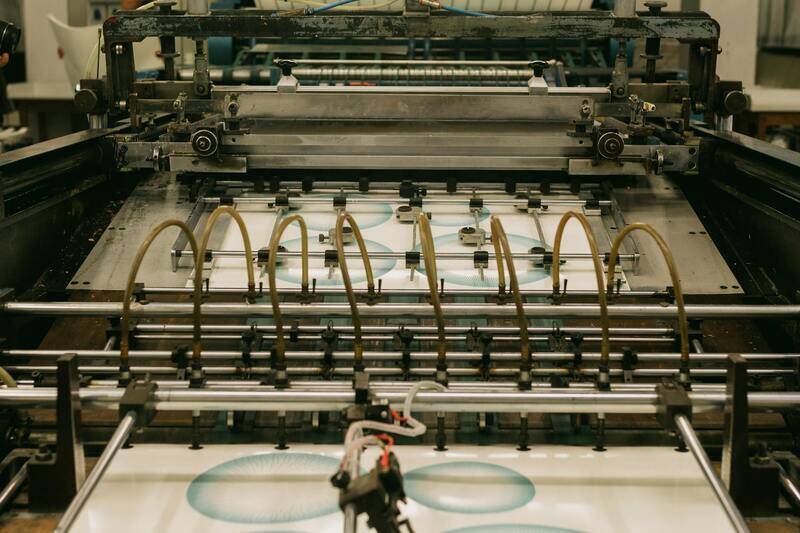
Types of Color Printing Technologies
In the realm of color printing, several essential technologies dominate the industry, each tailored to different needs and output specifications. The primary methods include offset printing, digital printing, flexography, and lithography. Offset printing is renowned for its high-quality output and cost-efficiency for large volumes, making it ideal for corporate brochures, catalogs, and packaging. Digital printing offers quick turnaround times and customization capabilities, suitable for short runs, personalized prints, or proofing. Flexography is often used for printing on flexible packaging and labels, employing fast-drying inks for production efficiency. Lithography, a predecessor to offset, remains relevant for fine art reproductions and long-run commercial printing. Each method has its unique advantages in producing vivid, accurate color reproductions depending on the project's scope and detail.
Color Calibration and Consistency
Maintaining color consistency across print runs is crucial for brand integrity and overall visual impact. This involves rigorous calibration of printing equipment and regular maintenance of color management systems. Synchronizing color profiles between digital files and printer hardware allows for accurate reproduction of hues specified during the design phase. Additionally, the use of standards such as ICC profiles enables printers to match colors precisely across different devices and substrates. Implementing routine color checks, including spectral measurements with spectrophotometers, ensures that each batch aligns with the predetermined color standards. Consistent calibration minimizes color discrepancies, reducing waste and rework, which ultimately saves costs and enhances customer satisfaction. A comprehensive color management workflow includes pre-press adjustments, proper handling of proofing materials, and ongoing monitoring of printing conditions.
Choosing the Right Color Mode and Palette
Selecting the appropriate color mode—either CMYK or RGB—is fundamental for achieving desired results in printed materials. CMYK, standing for Cyan, Magenta, Yellow, and Key (Black), is standard for most commercial color printing due to its compatibility with offset and digital presses. RGB (Red, Green, Blue) is primarily used for digital displays but can be converted into CMYK for printing. Proper use of color palettes and swatches ensures consistency and vibrancy. Limiting the color palette to specified tones can also optimize color output and reduce ink usage, resulting in cost savings and more predictable results. When designing for print, it’s important to consider color gamut limitations and choose a palette that fits within the printer’s capabilities to avoid color shifts.

Benefits of Printing in Color
Printed materials in full color significantly enhance visual appeal, conveying messages more effectively than monochrome options. Color printing helps establish brand recognition by using consistent color schemes, logos, and packaging designs that resonate with consumers. It enables marketers to create emotionally engaging content, increasing recall and impact. Additionally, color prints can convey complex data through vivid charts, infographics, and photographs, making information more accessible and compelling. The ability to reproduce a wide array of hues allows for detailed imagery and nuanced shading that can elevate the aesthetics of any printed piece. As a result, organizations investing in high-quality color printing often see improved engagement, higher conversion rates, and a more professional brand image.
Best Practices for Successful Color Printing
Achieving high-quality color prints requires adherence to established best practices that ensure vibrancy, accuracy, and consistency. Selecting appropriate colors, preparing the digital files correctly, and maintaining optimal printer settings are essential steps to produce professional results. Proper file preparation involves converting images to the correct color mode, typically CMYK, to match the printer’s output capabilities. Incorporating color profiles specific to the printer and media type helps manage color accuracy across different devices and substrates.
Furthermore, calibrating your printing equipment regularly plays a vital role in maintaining color fidelity. This involves using calibration tools to adjust the printer's color output, ensuring the printed colors match digital expectations. Consistent calibration minimizes discrepancies caused by ink or toner variations, media differences, or environmental factors such as temperature and humidity.
When designing for print, it is advisable to use color swatches and palettes that fit within the printer’s gamut, which is the entire range of reproducible colors. This prevents colors from appearing dull or shifting unexpectedly. Implementing proofing techniques, including soft proofs on calibrated monitors and hard proofs on actual media, allows for visual verification before the full print run. Proofing documents enable designers and printers to identify and correct color mismatches early, saving time and resources.

In addition to technical considerations, selecting the right media can greatly influence color outcomes. Glossy or semi-gloss papers tend to enhance color vibrancy, while matte finishes provide a more subdued, professional appearance. The compatibility of inks, toners, and media should be verified to prevent issues such as smudging, uneven coverage, or color bleed.
Adopting these best practices in color management not only enhances print quality but also improves efficiency and reduces waste. Consistency in colors across multiple print runs elevates the professionalism of marketing campaigns, packaging, or branding materials. Investing in skilled operators and maintaining a workflow that emphasizes color accuracy will ultimately maximize the impact of your printed pieces, ensuring they meet high standards of visual excellence.
Ensuring Accurate Color Reproduction in Printers
Achieving precise color output in print projects necessitates a thorough understanding of the printing process and meticulous handling of all relevant variables. To start, selecting high-quality, color-managed hardware and media is crucial. This includes printers equipped with advanced color management capabilities and media designed to support vibrant and consistent color reproduction.
Beyond hardware, implementing standardized color workflows ensures reliable results. Using industry-standard color management systems (CMS) allows for precise control over color profiles during file preparation, proofing, and printing. Embedding ICC profiles within design files ensures that the colors intended by the designer are faithfully reproduced by the printer, minimizing inconsistencies across different output runs.
Consistent calibration of monitors, printers, and media is essential. Regular calibration routines align the color output of these devices, reducing deviations caused by hardware aging or environmental factors. Maintaining such calibration schedules ensures each print accurately reflects the color specifications set during the design phase.

When preparing files for color printing, use vector-based graphics and high-resolution images to prevent pixelation and preserve color fidelity. Digital files should be converted to the appropriate color profile, such as Adobe RGB or sRGB, depending on scope and intended output conditions. Ensuring that all file elements are in the correct color space reduces surprises during printing, facilitating smooth workflows.
In addition, incorporating soft proofs on calibrated monitors allows designers and clients to preview how colors will appear in the final print. This step is invaluable for catching unwanted color shifts or mismatches before costly print runs are initiated. Hard proofing, which creates physical test prints, further verifies color accuracy, especially when working with complex color blends or branding colors that demand strict adherence.
Maintaining open communication with print service providers, providing detailed specifications, and reviewing proof samples are critical actions. Experienced professionals can advise on media choices, ink options, and finishing techniques that influence color vibrancy and durability. This collaborative approach results in consistently high-quality printed materials that conform closely to design expectations.

In summary, reliable color reproduction hinges on a combination of advanced technology, precise workflows, and ongoing quality assurance practices. By investing in the right equipment, following strict calibration routines, preparing files correctly, and maintaining clear communication with print professionals, organizations can produce vibrant, consistent color prints that effectively convey their visual identity and message.