Portrait or landscape: choosing the best orientation for business cards
Most people choose card stock and finish before considering how the card should sit in the hand. Orientation is one of the most significant design choices, affecting how readers scan the details, how a logo fits, and how the back of the card is utilized. Before ordering business cards, it's important to understand how portrait and landscape layouts impact a name card, and where each layout may fall short.
This guide explores both layouts for a standard business card size, highlighting the practical trade-offs and offering instructions on how to set up a print-ready file that will survive the trim, regardless of the layout chosen.
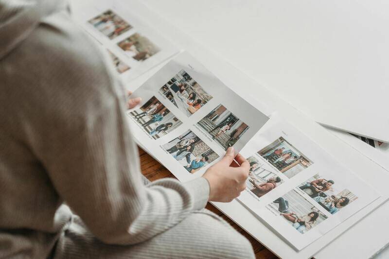
What do "portrait" and "landscape" actually mean on a card?
Landscape refers to the horizontal layout that most people envision when they think of a business card. This layout is wider than it is tall. The standard dimensions are approximately 90 by 54 mm, or 3.5 by 2 inches, depending on your region.
That shape matters more than it seems. A horizontal card provides a long line to run a name, title, and phone number across. A vertical card, on the other hand, offers a narrow column, which necessitates shorter lines and a stacked hierarchy. Neither orientation is incorrect; they are suited to different amounts of information and different brand identities.
Where landscape business cards work
Landscape is the safe default for a reason. Wallets, card holders and the little slots in a Rolodex are all built around horizontal cards, so a landscape design slides in and out the way people expect. If your details include a longer job title, a company name and a street address, the extra width keeps each line readable without shrinking the type. For most professional business cards in law, finance, clinics and trades, horizontal is the layout that gets kept and used.
Where portrait business cards find their place
Vertical business cards read as deliberate. Because fewer brands use them, a portrait name card stands out in a stack, which is part of why designers, photographers, salons and F&B brands reach for them. The vertical column suits a strong logo at the top, a short name underneath and a tidy block of contact details at the base. It also plays well with a bold colour band down one side. The catch is space: if you have a lot to say, a portrait layout gets cramped fast, and readers have to turn the card to scan it.
The trade-offs, side by side
There is no one-size-fits-all solution, so tailor the layout to the content the card needs to carry. A quick way to compare:
| Factor | Landscape | Portrait |
|---|---|---|
| Room for text | Generous width for long lines | Narrow, better for short entries |
| Fits standard holders | Yes, designed for it | Usually, but a tight fit in some slots |
| Stands out in a stack | Familiar, blends in | Distinctive, catches the eye |
| Logo placement | Left or centre works well | Strong top-anchored logo |
| Reading effort | Scanned without turning | May need a quarter turn |
One point people miss: orientation can differ front to back. A common trick is a landscape front for the details and a portrait-friendly graphic on the reverse, or the other way round. Double sided name cards let you use the back for a QR code, a tagline or a map, so you are not forced to cram everything onto one face. If you want the full logic of using the reverse, our note on double-sided name cards and making use of the back covers it in more detail.
Reading order and hierarchy
Whatever orientation you choose, the eye should land on the most important thing first, usually the name or the logo, then move down a clear path. Landscape tempts people to spread five items across the width with no obvious order, which reads as a wall of text. Portrait tempts people to centre everything, which can feel static. In both cases, group related details, keep two type sizes at most for body information, and leave breathing room. A card that is easy to read at arm's length beats a clever one that needs squinting. Our guide to choosing fonts and colours for readable cards pairs well with this if you are refining the type.
Do not forget the physical details
Orientation interacts with things you set elsewhere. Rounded corners read differently on a tall card than a wide one. A spot UV logo sits better with room around it, which a busy portrait layout may not give. And card thickness affects how a vertical card feels when held at the short edge, since a flimsy stock bends more noticeably in portrait. If you are still weighing stock, the breakdown in card thickness explained across 260 to 400 gsm is worth a look before you commit.
Setting up the file to ensure a clean trim.
The most common orientation mistake is creating a file with incorrect dimensions, causing the artwork to be rotated at the press. This results in the bleed being in the wrong place. To avoid this, set your document to the finished orientation from the start.
- Create the document in its final orientation without rotating it.
- Set the bleed to 3 mm on all four sides, and extend the backgrounds into the bleed area.
- Keep text and logos within the safe zone, away from the trim.
- Ensure that the front and back align when mixing orientations.
- Export a print-ready PDF with embedded fonts and images at 300 dpi.
For a full checklist, see how to set up a print-ready business card file. Getting this right once saves a reprint later.
Print your chosen orientation with us
Once you have decided on portrait or landscape orientation, we can transform your file into finished cards without any guesswork. At JustPrintCard, we specialize in printing business cards and name cards in both orientations at the standard business card size. We offer a range of stocks from 260 to 400 gsm, and various finishes including matte, gloss, or soft-touch. We also provide options such as rounded corners, spot UV, and foil.
If you would rather start from a tested layout, our business card printing and name card printing sections give you a running start in either orientation. Browse the wider business and name cards range to compare stocks and finishes, and reach out through our contact page if you want a hand deciding which way your card should sit.
Choose the orientation that best suits the content of your card. Set up the file in that orientation from the very first click. To minimize risks, order a small run first so you can physically inspect the card before committing to a full box.